How Breaking Bad with Charts Is Sometimes Good
Certain conventions govern data visualization to prevent accidentally or intentionally misleading learners. Professional designers know and apply these methods in both traditional and novel ways to shape fact finder perception of the evidence and its meaning. Knowing these rules can protect you.
But when conventional means fail to convey adequately a desired message, designers may achieve better results by breaking the rules without misleading the learner. In this post, I concentrate on two data visualization taboos and when breaking bad is sometimes good: the cumulative data chart and demonstrating causation through correlation.
The cumulative effect.
Cumulative data charts get a bad rap because they can hide information or create a false impression of performance or growth.
“Using cumulative data is always misleading, graph or no graph. There has to be a very specific purpose to it, otherwise it makes little sense to present cumulative data at all.” (Akjmatullina, 2019)
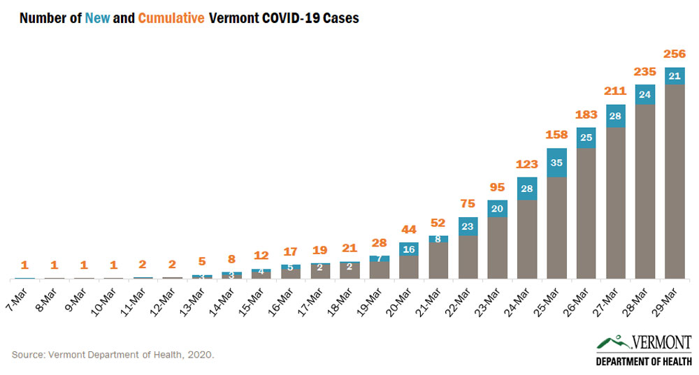
We became very familiar with one specific purpose of cumulative data charting during the coronavirus pandemic in daily count reports of confirmed COVID-19 cases in the population. The saving graphical technique in this chart is inclusion of the differently colored daily total (blue). Perhaps a more logical combination would place the daily column below the cumulative column. (Vermont, 2020)
Cumulative charting for litigation graphics.
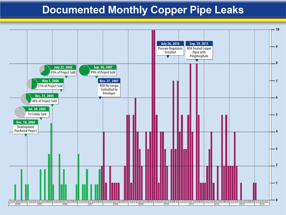
Here’s how breaking the rule against using cumulative data worked well for a homeowners association plagued with persistent plumbing leaks.
This periodic column chart demonstrates how the conventional method of visualizing monthly data in individual columns fails to convey the cumulative burden of repairs on the HOA and actually creates the impression that the source of the problems was close to resolution:
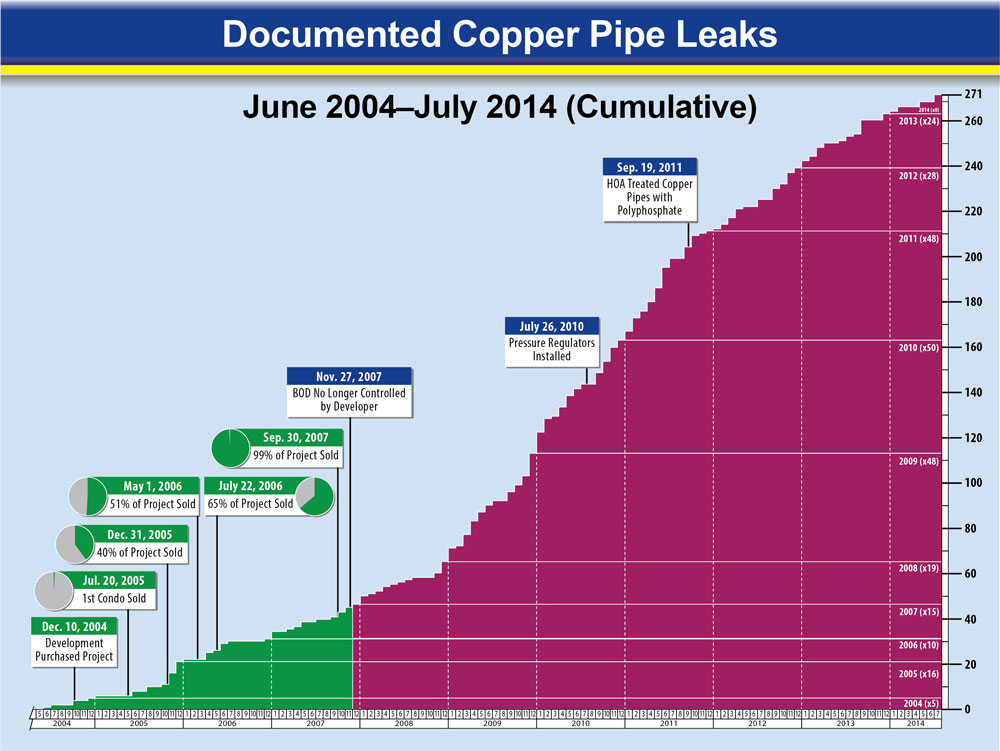
A better approach to emphasize the repair burden is a cumulative data chart. The “specific purpose” cited by Akjmatullina to justify presenting cumulative date was, after assuming control of the property 42 months after construction, the HOA made over two hundred additional repairs in the following seven years.
While neither chart alone presents an accurate picture of historical performance and a prediction of future problems, it met the client’s needs in settlement negotiations and helped the client avoid trial.
Stacking the numbers in your favor.
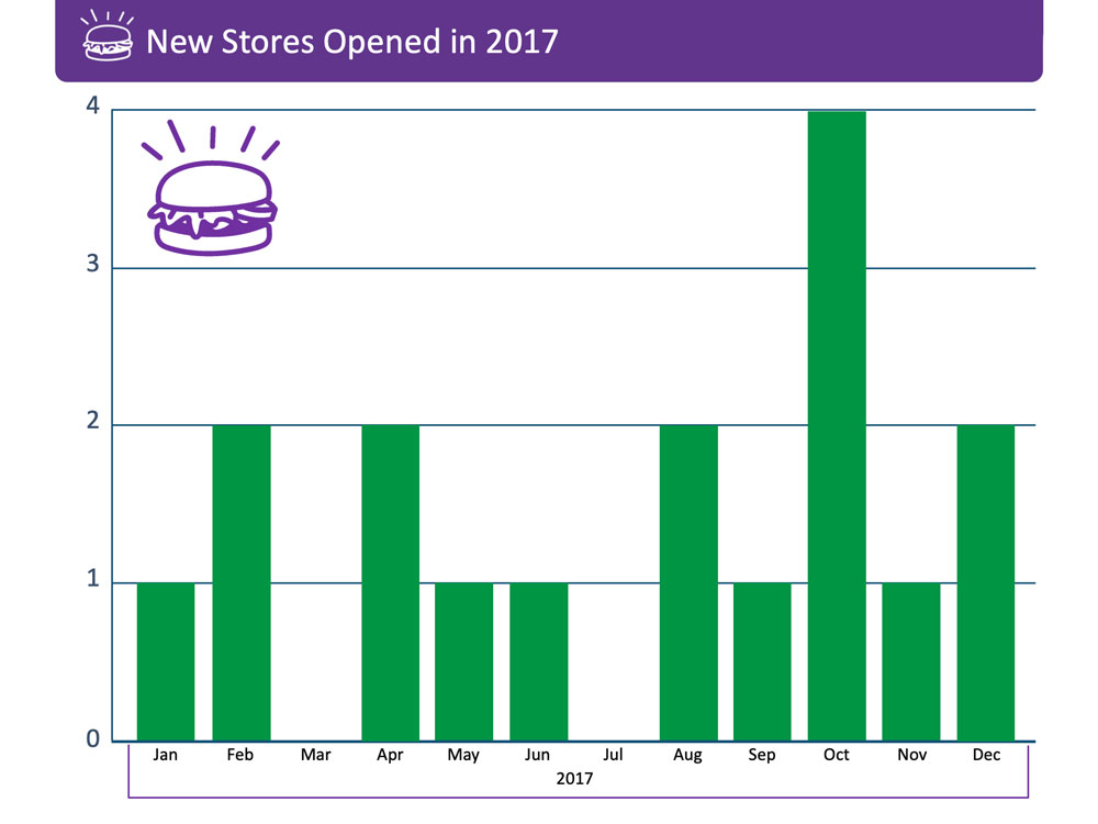
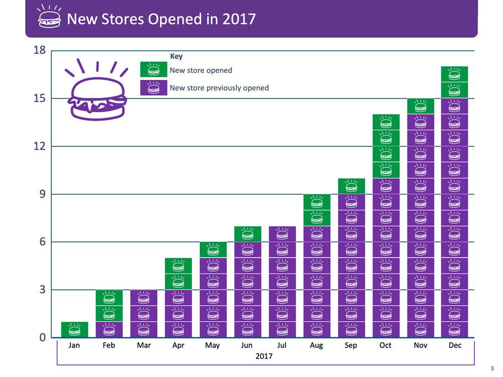
Here’s another variation of a cumulative chart with an added twist. In this case, trial counsel wanted to demonstrate when a fast food enterprise expanded its locations by seventeen stores in one year it accomplished a magnificent achievement. The conventional periodic column chart (below left) did not have the impact client wanted so I designed a cumulative stacked column chart (below right).
In the stacked version, the cumulative column effect is enhanced by inserting 97 icons representing individual stores in existence during any month with each month’s new store(s) colored green. Is this proper?
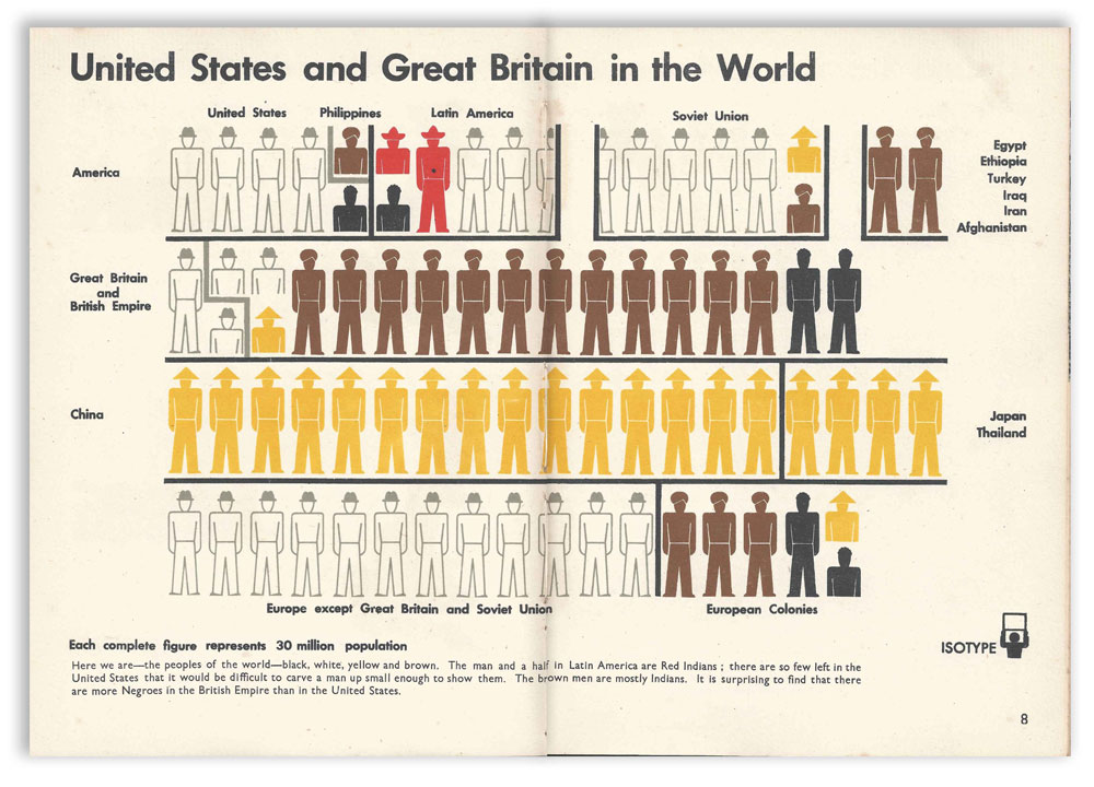
The technique of stacking icons, or “isotypes,” to quantify a periodic total has strong precedent and is now an accepted convention. The method is attributed to a German couple and a colleague, Otto and Marie Neurath, and Gerd Arntz, who invented the International System of Typographical Picture Education (ISOTYPE). In 1925, Otto founded a museum in Vienna for educating the public on social and economic issues with the prescient motto: “It is better to remember simplified images than to forget exact figures.” (Forrest, 2020)
Suggesting causation through correlation.
Correlating disparate evidence to demonstrate cause and effect relationships violates the statistician’s mantra, correlation doesn’t equal causation. (Green, 2012)
In dozens of product liability cases nationwide against manufacturers of dietary supplements containing Ephedra, plaintiffs claimed ingestion at prescribed doses was the proximate cause of sudden cardiac death. Eventually, the FDA outlawed Ephedra and most cases settled before trial. I had a front row seat to this litigation when I was engaged by the Defendants’ Coordinating Counsel for several matters.
The consistent defense positions were there was no reliable science (i.e., randomized controlled studies) proving the causal link between Ephedra use and adverse cardiovascular outcomes, and plaintiffs relied mostly on anecdotal association and “junk science” to sell their causation theories to fact finders.
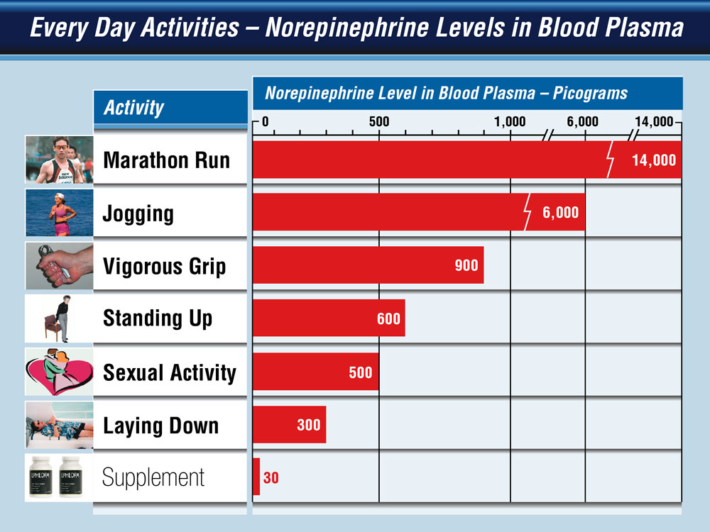
An effective tactic by the defense was demonstrating how certain “non-dangerous” normal or healthy activities produced much higher norepinephrine levels naturally than the accused products produced when taken at recommended doses.
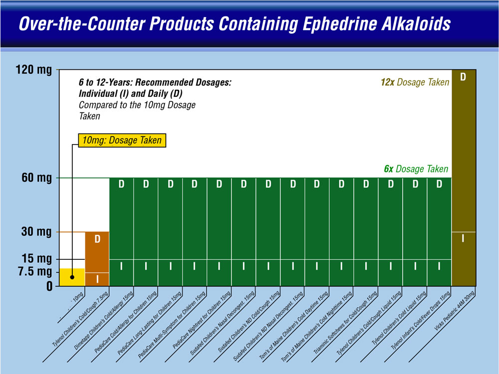
Another approach compared low dosage levels of ephedrine in the accused supplements with much higher levels in common over-the-counter medications.
While correlations to healthy activities and common medical products did not prove Ephedra was safe, it demonstrated how correlation and association—the same tactic used by plaintiffs—suggested Ephedra was not dangerous.
Correlating lawyers to breaking bad.
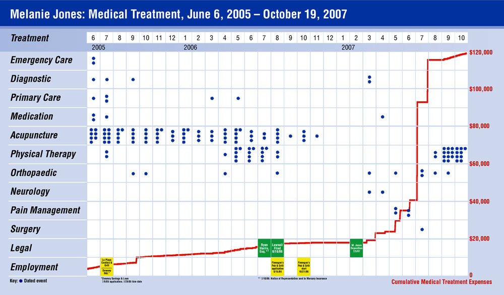
In this matter, the plaintiff suffered a relatively minor auto accident soft tissue injury and over the course of about two years underwent dozens of physical therapy treatments to a seemingly complete recovery. However, about two years post-accident, she started a new regimen of medical treatments and incurred rising medical costs coinciding with her lawsuit.
The defense counsel believed the coincidence was suspicious and asked me to visually demonstrate the cause and effect relationship between her litigation and a six-fold increase in medical costs for treatments referred by her lawyer to a group of plaintiff-friendly medical practitioners.
The hybrid chart above features a 12-level dot matrix timeline comprising different kinds of medical treatments and a few employment and litigation-related events. Overlaid is a cumulative line graph of medical costs. For about two years post-accident the plaintiff’s costs never exceeded $20,000 but after the lawsuit was filed, they rose to about $120,000 within an 8-month period. The unmistakable takeaway is that the plaintiff’s engagement of a lawyer was the catalyst for this expensive change. The case settled before trial.
Visualization alone proves nothing.
Because “we are easily seduced by our numbers and by the charts that represent them,” (Cairo, 2019) we have to be vigilant about data visualization misuse and misrepresentation, even if traditional conventions are adhered to strictly.
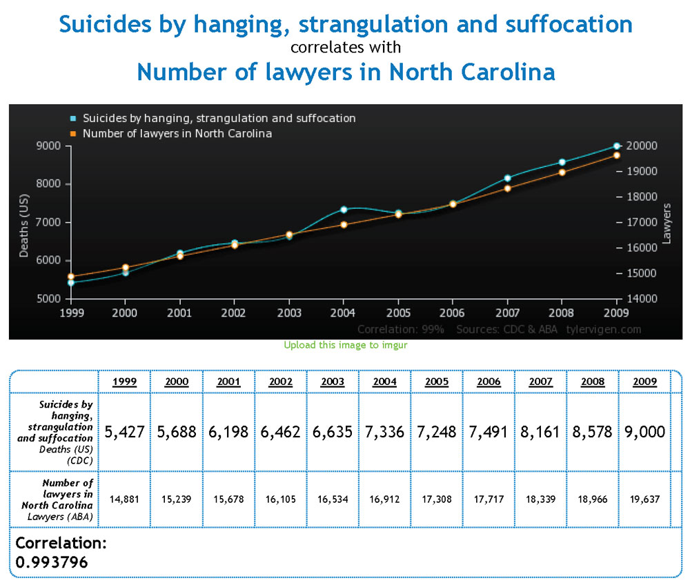
I leave you with a cautionary demonstration of why the statistician’s mantra, correlation doesn’t equal causation is good advice lest you believe the number of suicides by hanging, strangulation, and suffocation correlate to the number of lawyers in North Carolina. (Vigen, 2020) (Vigen, 2020)
Jim Gripp is a pioneering founder of Legal Arts, Inc. He has over forty years-experience as a litigation graphics consultant and private investigator. Email Jim at jgripp@legalarts.com.
Endnotes
Akjmatullina, Ainur, “Misleading graphs in statistics – how not to get fooled by them,” Aspect market Research, 24 July 2019, last retrieved 23 March 2020 at https://aspectmr.com/misleading-graphs/
Forrest, Jason “Exploring Isotype Charts: ‘Only An Ocean Between,” published in Nightingale The Journal of the Data Visualization Society, 17 February 2020, last retrieved 22 June 2020 at https://medium.com/nightingale/explaining-a-single-isotype-creating-simplicity-from-complexity-15c174580336
Cairo, Alberto, How Charts Lie: Getting Smarter about Visual Information, W.W. Norton Company, 2019.
Green, Nathan, “Correlation is not causation. Repeat after me, correlation is not causation, correlation is not causation, correlation is not causation …,” The Guardian US edition, 6 January 2012, last retrieved 23 March 2020 at https://www.theguardian.com/science/blog/2012/jan/06/correlation-causation
Vermont Department of Health, last retrieved 30 March 2020 at https://www.healthvermont.gov/response/infectious-disease/2019-novel-coronavirus
Vigen, Tyler, Spurious Correlations website, chart #3857, last retrieved 28 March 2020 at http://tylervigen.com/view_correlation?id=28671 and used with permission.
